THINK CLEAR. GROW CONNECTED.
Clicko brand kit.
Logos, icon, colours and type for anyone writing about Clicko, partnering with us or building something with our name on it. Please use the files as they are.
01 / Logo
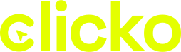
A cursor clicking into the C of “clicko”. Use the full logo wherever there’s room, and pick the version that matches your background.
For dark backgrounds
For light backgrounds
Dark logo on Click Lime
Dark backgrounds only
Print, watermarks
02 / Icon
For profile pictures, app icons and favicons, where a square shape works better than the full logo.
On dark
On lime or light
On photos and colour
03 / Colour
Night and Paper do most of the work. Lime is for the logo, buttons and one highlighted word.
#0B0E0C
RGB 11 14 12Backgrounds, text on lime
#E4FF00
RGB 228 255 0Logo, buttons, highlights
#F3F5EE
RGB 243 245 238Text on dark, light pages
#1A201C
RGB 26 32 28Cards and panels
#7D877F
RGB 125 135 127Captions and borders
#FF6B4A
RGB 255 107 74Alerts, used rarely
04 / Typography
Both are free on Google Fonts.
Headings
Space Grotesk
Headlines and numbers. Medium or Bold, tight letter spacing.
Body
Manrope
Paragraphs, buttons, captions. Regular to Bold.
05 / Usage
A few rules so the logo looks right everywhere.
Do
Don't
Writing the name
Clicko ✓ · ClickO · CLICKO · Click-o
In sentences, write “Clicko” with a capital C. The logo itself is always lowercase.
Press, partners and print files: we’ll send what you need.
Make yourself comfortable.